
- TypeWebinar

- Location Aurora, Colorado, United States

- Date 11-09-2018
Education/Teaching/Training/Development
Business Development
Finance
Administration/Management
Fresher/Trainee/Professionals
OVERVIEW
Your business landscape might be exacting but you don’t have to compromise on your aspirations. Just brush up your skills with our upcoming webinar.
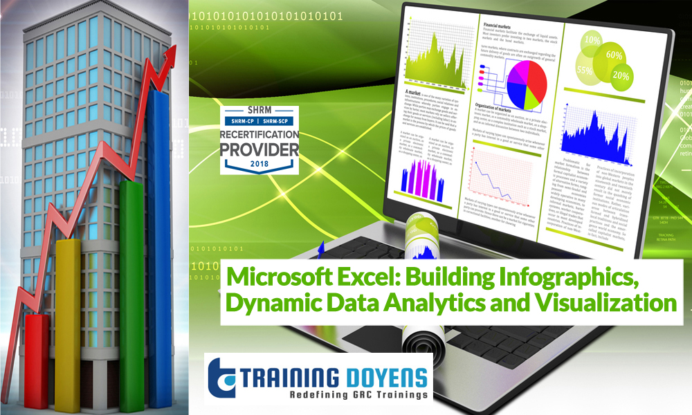
Excel can create an incredible assortment of chart and visualization types, far beyond the bar charts and pie charts you’ve seen a thousand times. Join the webinar to learn how to create icon- and map-based visuals, as well as dynamic dashboards that update as your data changes.
Key points to be covered in the webinar:
LEARNING OBJECTIVES
Excel can create an incredible assortment of chart and visualization types, far beyond the bar charts and pie charts you’ve seen a thousand times. In this session, we’ll demonstrate how to create icon- and map-based visuals, as well as dynamic dashboards that update as your data changes.
WHO WILL BENEFIT
C-level Executives
Sales professionals
Marketing professionals
Educators and Trainers
Business Analysts
Consultants
… And anyone who needs to communicate numbers.
SPEAKER
Neil Malek is principal at Knack Training, a software training company specializing in Microsoft products. For nearly two decades, Neil has been working with non-profits, governments, and Fortune 500 companies to identify and address skills gaps
For more detail please click on this below link:
Email: [email protected]
Toll Free: +1-888-300-8494
Tel: +1-720-996-1616
Fax: +1-888-909-1882
Know about the various data visualization tools in Excel and how to create graphical charts with symbols, pictures, maps, and more. Also learn how to visualize and communicate the important insights in your business
Training Doyens 26468 E Walker Dr,Aurora, Colorado
+1-720-996-1616