
- TypeWebinar

- Location Denver, Colorado, United States

- Date 18-08-2020
Business Development
Finance
Administration/Management
Accounting/Financial/Banking/Insurance
Advertising/Marketing
OVERVIEW
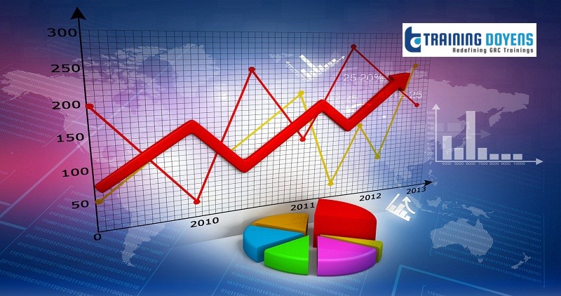
They say that a picture is worth a thousand words. Using Excel charting tools to visually display complex Excel data communicates the data’s message much more effectively to your target audience.
Chart and graphs are visual representations of your data. Viewing the data graphically makes the data less confusing and increases comprehension. It is easier to spot trends and patterns in your data sets.
Charts in Excel update automatically when the data is modified, so charts are always current.
Become more productive and efficient at communicating data to others.
WHY SHOULD YOU ATTEND
Attend this Microsoft Excel training to learn how to visually represent business data more effectively. Charts can be created not just in Excel, but also in PowerPoint, Word, and Outlook, making learning these tools extremely useful. Charts already in Excel can be copied and/or linked to Word and PowerPoint.
AREAS COVERED
• Creating charts in Excel
• Defining the components of a chart
• Formatting a chart
• Modifying a chart
• Adding chart elements
• Adding, editing and removing data
• Annotating with Trendlines
• Creating a combination chart and advanced Excel charts
• Using sparkline chart, Excel
• How to make a graph in Excel
LEARNING OBJECTIVES
You will learn how to create charts in Excel based on a variety of data sets.
There are so many chart types to choose from, and you will understand which chart type presents the data from which perspectives.
We will start with very basic charts, modify the data being represented in the chart and advance into more complex combination charts. You will also learn how to format the charts to create the perfect emphasis of data.
Learn to embed Sparklines, mini charts, right inside of a cell.
WHO WILL BENEFIT
This session is aimed at Excel users who have intermediate level knowledge and who wish to take their knowledge and understanding of the application to the next level.
• Business Owners
• CEO's / CFO's / CTO's
• Managers
• Accountants
• CPA's
• Financial Consultants
• IT Professionals
• Auditors
• Human Resource Personnel
• Bookkeepers
• Marketers
• Anybody with large amounts of Data
Anybody who uses Microsoft Excel on a regular basis, and wants to be more efficient and productive
SPEAKER
Years of Experience: 44+ years
Areas of Expertise: Microsoft Office
Cathy Horwitz believes that when your employees know the capabilities of the software they use, they will demonstrate improved productivity, will be more efficient and will be able to problem solve more easily.
Cathy teaches classes on the Microsoft suite of application software including Excel, PowerPoint, Word, Access and Outlook. Cathy has over 30 years of experience in classroom training and application support with personal computers and has been an instructor for the Microsoft Office Suite since 1989.
Her strengths include customizing classes based on the needs of individual students and providing realistic business examples to compliment training. She is a high energy trainer with a flair for training the adult student.
When not teaching, Cathy enjoys shopping estate sales and refinishing mid-century furniture.
Use Promo Code SUMS20 and get flat 20% discount on all purchases.
To Register (or) for more details please click on this below link:
Email: [email protected]
Toll Free: +1-888-300-8494
Tel: +1-720-996-1616
Fax: +1-888-909-1882
Learn how to create charts in Excel for visual representation of data. The webinar discusses various Excel charting tools and how to use them to communicate insights more effectively.
26468 E Walker Dr, Aurora, Colorado 80016
+1-720-996-161626468 E Walker Dr, Aurora, Colorado 80016
+1-720-996-1616