
- TypeWebinar

- Location Aurora, Colorado, United States

- Date 13-06-2019
Education/Teaching/Training/Development
Finance
Administration/Management
Accounting/Financial/Banking/Insurance
Advertising/Marketing
OVERVIEW
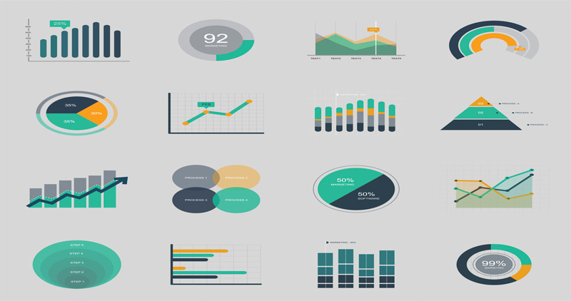
Data visualization is the representation of numerical data in a visual format so that your audience can quickly and easily understand it and gain insight from it. Our upcoming webinar discusses how to create, enhance and customize charts from your Excel data for effective data visualization.
The webinar covers the following key areas:
LEARNING OBJECTIVES
Learn how to select the most appropriate chart to convey your message
Learn how to create a chart from a set of data
Learn how to change the appearance of a chart (adding text, changing colors, fonts and more)
Learn how to enhance your message by using images within charts
WHO WILL BENEFIT
This training is categorized as basic-to-intermediate. It is aimed at users who have little or no knowledge of data visualization in Excel.
Attendees should be familiar with how to navigate around an Excel workbook and how to enter and edit data.
Although the training will be delivered using the latest version of Excel, this training is relevant for users of Excel 2010 and above.
SPEAKER
Mike Thomas has worked in the IT training business for 30 years. He is a subject matter expert in a range of technologies including Microsoft Office and Apple Mac.
Use Promo Code MKT10N and get flat 10% discount on all purchases
To Register (or) for more details please click on this below link:
Email: [email protected]
Toll Free: +1-888-300-8494
Tel: +1-720-996-1616
Fax: +1-888-909-1882
Check out our popular webinars:
1. Microsoft Outlook Tips and Tricks: Get More Organized and Efficient - http://bit.ly/2W99Fp7
2. Employee Investigations and Witness Interviews - 3 Hour Virtual Boot Camp - http://bit.ly/2LUkKdO
Master the techniques of data visualization in Excel. The webinar focusses on traditional and advanced charts to help you present numerical data in a meaningful way.