
- TypeWebinar

- Location Aurora, Colorado, United States

- Date 30-07-2020
Education/Teaching/Training/Development
Business Development
Finance
Administration/Management
Fresher/Trainee/Professionals
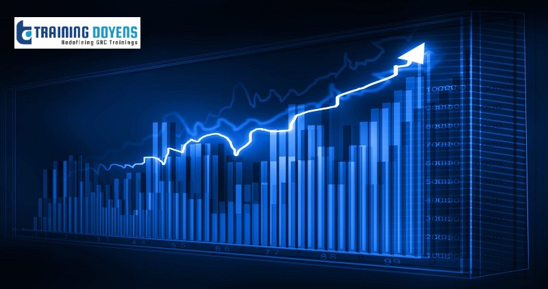
While Excel is a very versatile tool for data visualization and includes chart templates, it does not incorporate design best practices. Our upcoming webinar helps you develop better graphs and charts in Excel by incorporating the art and science of data visualization.
The webinar covers the following key areas:
LEARNING OBJECTIVES
You’ve looked at the data and created a few charts in Excel. Now you’re ready to send out your report. Wait. Have you ensured that your graphs are compelling? Do they follow design best practices? This hands-on webinar will give you the tools to immediately elevate your Excel data visualization skills.
WHO WILL BENEFIT
Anyone who needs to communicate with data. This includes:
. Business/Data Analysts
. HR Professionals
. Marketing Professionals
. Entrepreneurs
. Finance Professionals
Speaker Profile: Rebeca Pop is the founder of Vizlogue, a Data Visualization and Storytelling Lab that offers training and consulting services. Rebeca has spent the last 10 years working in media and digital analytics.
Use Promo Code SUMS20 and get flat 20% discount on all purchases.
To Register (or) for more details please click on this below link:
Email: [email protected]
Toll Free: +1-888-300-8494
Tel: +1-720-996-1616
Fax: +1-888-909-1882
Check out our popular webinars:
Addressing Wage and Hour Issues During the COVID-19 Pandemic - https://bit.ly/2Z6EdwB
Learn the techniques of analyzing and visualizing data with Excel more effectively using various features in the application. The webinar also discusses how to build interactive Excel dashboards, how to add a chart in Excel and more.