
- TypeWebinar

- Location Denver, Colorado, United States

- Date 30-06-2020
Business Development
Finance
Accounting/Financial/Banking/Insurance
Advertising/Marketing
OTHERS
OVERVIEW
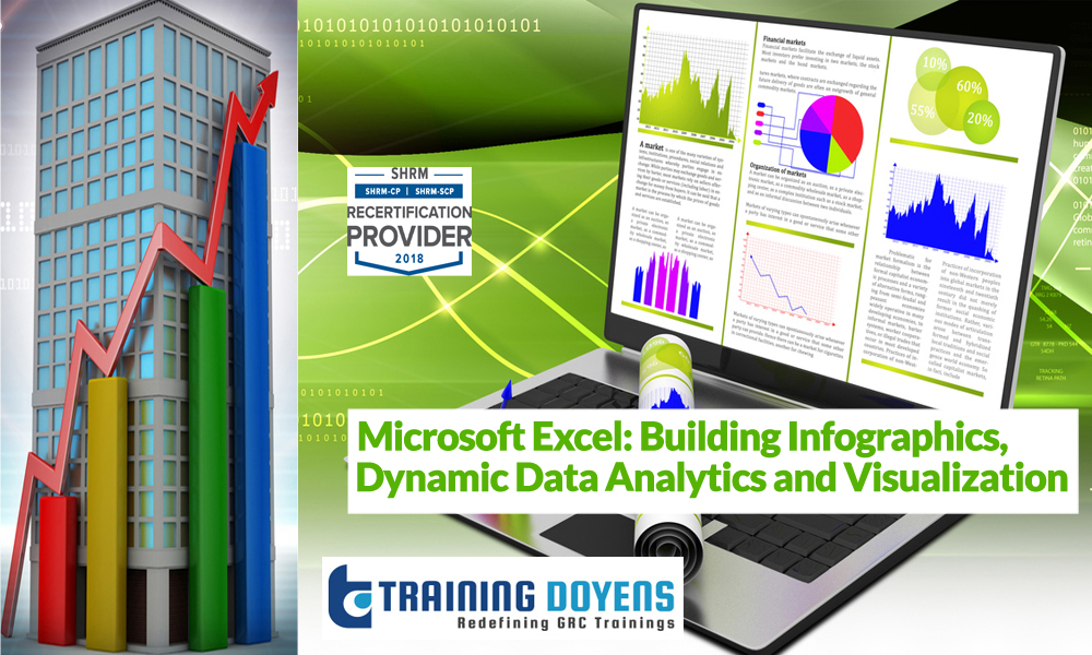
As we hurtle toward 2020, every list of essential job skills and core competencies contains the following ideas: Data Analytics, Data Visualization, and Communication. While there are certainly a host of new tools and technologies to help us with that, the tools we already know and use daily have vast untapped potential. Microsoft Excel, certainly, gets a bad rap when it comes to ‘data visualization,’ but that’s almost entirely because people don’t know how to use the tools in the box!
In this Excel data visualization training, we’ll highlight a number of professional and compelling techniques for analyzing and visualizing data with Excel. These can be used to build Excel infographics, slide decks, reports, or any other sort of communication medium. You don’t need to invest money in new software – Excel can handle nearly anything.
When you can visualize and communicate the important insights in your business, you are far ahead in many different areas. Market your ideas to a new audience with beautiful and compelling visuals; get buy-in to fund your new business idea; sell clients on the effectiveness of your solutions. As people who live ‘close to the numbers,’ it can be very difficult to effectively communicate your message to people ‘outside the bubble.’ These tools will cut through the noise and create change.
WHY SHOULD YOU ATTEND
Unlike many webinars, Neil’s sessions are 100% hands-on real-world examples of the skills he’s presenting. After this session, you’ll have a screenshot-laden step-by-step guide to performing the techniques we cover. You’ll be able to apply these skills directly to your work with almost no adjustment, and with a very short learning curve.
AREAS COVERED
• Data visualization tools in Excel for creating graphical charts with symbols, pictures, maps, and more
• Highlighting relevant data dynamically with conditional formatting
• Isolating critical points with logical functions
• Leveraging essential design skills to understand and deliver for your audience
• Using obscure tools like the Camera and Pivot drill-downs to build incredible dashboards
LEARNING OBJECTIVES
Excel can create an incredible assortment of chart and visualization types, far beyond the bar charts and pie charts you’ve seen a thousand times. In this session, we’ll demonstrate how to create icon- and map-based visuals, as well as dynamic dashboards that update as your data changes.
WHO WILL BENEFIT
• C-level Executives
• Sales professionals
• Marketing professionals
• Educators and Trainers
• Business Analysts
• Consultants
… and anyone who needs to communicate numbers.
SPEAKER
Years of Experience: 20+ years
Areas of Expertise: Microsoft Products
Neil Malek is principal at Knack Training, a software training company specializing in Microsoft products. For nearly two decades, Neil has been working with non-profits, governments, and Fortune 500 companies to identify and address skills gaps.
Neil is a Microsoft Certified Trainer, Adobe Certified Instructor, and CompTIA Certified Technical Trainer from Orlando, FL. His career, spanning from the Center from Instructional Technology and Training at the University of Florida to his current business, has led him to train on products from Microsoft Office, SharePoint, Teams, and OneDrive to Adobe Acrobat and Creative Cloud, to the Google Suite for Business, and includes professional development topics like presentation design and delivery.
Neil’s work currently focuses on using Office power tools to analyse information, present it effectively, and automate business processes that would otherwise rob us of time, energy, and enthusiasm.
Use Promo Code MDTD20 and get flat 20% discount on all purchases.
To Register (or) for more details please click on this below link:
Email: [email protected]
Toll Free: +1-888-300-8494
Tel: +1-720-996-1616
Fax: +1-888-909-1882
Learn the techniques of analyzing and visualizing data with Excel using Excel infographics, slide decks, reports and more. The webinar also discusses how conditional formatting and logical functions can be used for preparing insightful reports.
26468 E Walker Dr, Aurora, Colorado 80016
7209961616 Fax No: 8001626468 E Walker Dr, Aurora, Colorado 80016
7209961616 Fax No: 80016