Organization Name / Organize By
AtoZ Compliance
Organizing/Related Departments
E-learning
Organization Type
Training/Development
Training or Development ClassCategory
Both (Technical & Non Technical)
Training or Development ClassLevel
International
Related Industries
Education/Teaching/Training/Development
Finance
Location
New York, United States
KEY TAKE AWAY
This Excel dashboard course webinar will work with everyday Excel to create dashboards that inform quickly, update dynamically, and can flex with the needs of the moment. It will be presented from Excel 2010 and Excel 2016 with wide applicability to Excel 2007 and 2013.
OVERVIEW
Staring at data and flipping through reports and worksheets is a time-consuming way to stay on top of what’s most important for your organization. Visualizing business information in ways that make an immediate impact may seem “advanced.” But the necessary skills are actually within reach of any Excel user with a relatively good grasp of the basics.
- We will first cover the basics of Microsoft Excel training on list management for data sources which reside in Excel
- We’ll discuss the various ways to leverage externally based data for your dashboards
- After a review of Pivot Table and chart basics, we’ll begin constructing a dashboard
- You’ll learn how to make your dashboards interactive to suit a variety of end-uses and end-users
- We’ll explore several techniques for working with graphics and layouts to ensure that your dashboards have a professional and polished look
- We’ll discuss the role of macros for dashboards, when they are useful, and when they can be a liability
WHY SHOULD YOU ATTEND
- “Dashboard” has become a business buzzword that is applied to a variety of data visualization techniques, many of which sound complicated and be very expensive. But, if you have advanced Excel training, you have the tools at your fingertips to build dynamic and actionable dashboards right in an Excel workbook. By leveraging skills, you already have (or pick up through Excel training online), you save time on learning curve, as well as potentially unnecessary investments in complex applications, and re-engineering of data structures to fit a new mold
- We are all searching on how to learn Microsoft Excel for ways to be more effective on the job and deliver more and more relevant results. We should have in our toolbox the method and means to quickly analyse the ever-increasing pile of data and report in a way that is accessible to our organizations
- One of the best “surprises” of learning to create dashboards in Excel through Microsoft Excel training online,is that you will learn more about the data you use every day by visualizing in various forms. We may be assembling a dashboard to report on productivity goal A and notice that it is impacted in a way we did not notice before by factor B. That is the power of visualizing data
AREAS COVERED IN THIS WEBINAR
- The success and impact of your dashboard is absolutely dependent upon your understanding of Microsoft Excel training courses. We’ll cover how to determine what goes and what stays. We’ll cover what is actual dashboard “fodder” and the optimal collection of data objects to suit the goal of the dashboard user
- How to manage data sources which originate or are exported to Excel. What structures work with this method, and which do not
- Learn the repair steps for datasets that are not optimal. We’ll cover Text to Columns, text functions, and IF statements that transform your data into a gold mine of information
- Learn the steps to access external data sources and why even Excel data should be accessed as an external source. We’ll cover considerations for accessing databases directly, when to move toPowerPivot and how this differs between 2010 and the most current versions of Excel
- We’ll cover step-by-step how to create pivot tables to use on or as a foundation for your dashboards
- Learn how refresh works and the “gotchas” to be aware of. (The worst error to get in Excel doesn’t come with an error message!)
- We’ll discuss choosing the right charts for your audience and purpose, when Sparklines are the right tool and how to leverage conditional formatting for instant status information. How to control “chart creep” on your dashboard to provide a consistent experience
- Next we’ll go over the options for implementing interactivity into your dashboards, how to employ Slicers, report filters, and other user interaction techniques to make your dashboards end-user friendly and relevant
- Learn how to optimally lay out your objects and elements, how to avoid unnecessary scrolling and endless tweaking to get it to look right. How to deal with the automatically resizing feature of Pivot Tables
- Finally, we’ll have a look at how to create other graphic elements that work like pictures and behave like data
LEARNING OBJECTIVES
- To acquire the skills necessary to leverage/ create a dashboard in Excel to visually present data with common application functionality
WHO WILL BENEFIT
- Data Analysts
- Financial Professionals
- Audit Professionals
- Logistics Analysts
- Market Research Analysts
- Human Resources
- Payroll Professionals
SPEAKERS PROFILE
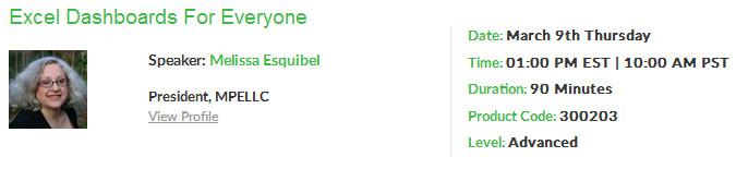
Melissa Esquibel
Melissa Esquibel specializes in empowering users of office productivity software. As a Microsoft Certified Trainer (MCT) with more than 25 years in business application technology, Melissa has a unique ability to make learning programs enjoyable AND valuable.
Whether teaching how to crunch numbers with Excel, deliver compelling presentations in PowerPoint or generate business-winning proposals and reports with Word, Melissa impresses clients with her knowledge and instruction.
Others Details
Excel dashboard course to create informative dashboards by working with graphics and the role of macros
For more details and updates please visit event website
Registration Fees
Available
Registration Fees Details
Live Webinar- $135
for one participant
Registration Ways
Email
Phone
Website
Address/Venue
online Training
Pin/Zip Code : 11040